Food Menu Icons
Clean food illustrations into transparent assets for menus, delivery apps, and ordering screens.
Best For
Cleanup Workflow
Clean the Background
White-background food images use the fast path, while uncertain backgrounds can be retried with AI cleanup.
Center the Dish
Fit the food into a square canvas without cropping important plate or bowl edges.
Choose a Preset
Export menu assets using practical Food, Icon, or Large sizes depending on where they will be used.
Save as WebP
Keep transparency while downloading a lightweight file that works well in apps and websites.
Recommended Output
200 × 200
A compact size for menu thumbnails and list images.
256 × 256
Useful for category icons and smaller UI images.
1024 × 1024
Better for detail screens or keeping a clean source asset for later edits.
Real Food and Sticker Samples
These samples show two common ByteCut inputs: illustrated food images that need a clean menu thumbnail, and transparent sticker outputs that need compact reusable WebP files.
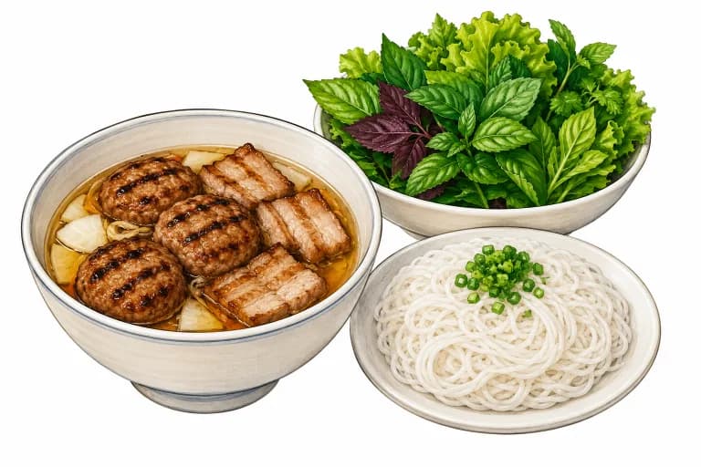
Source-style food image
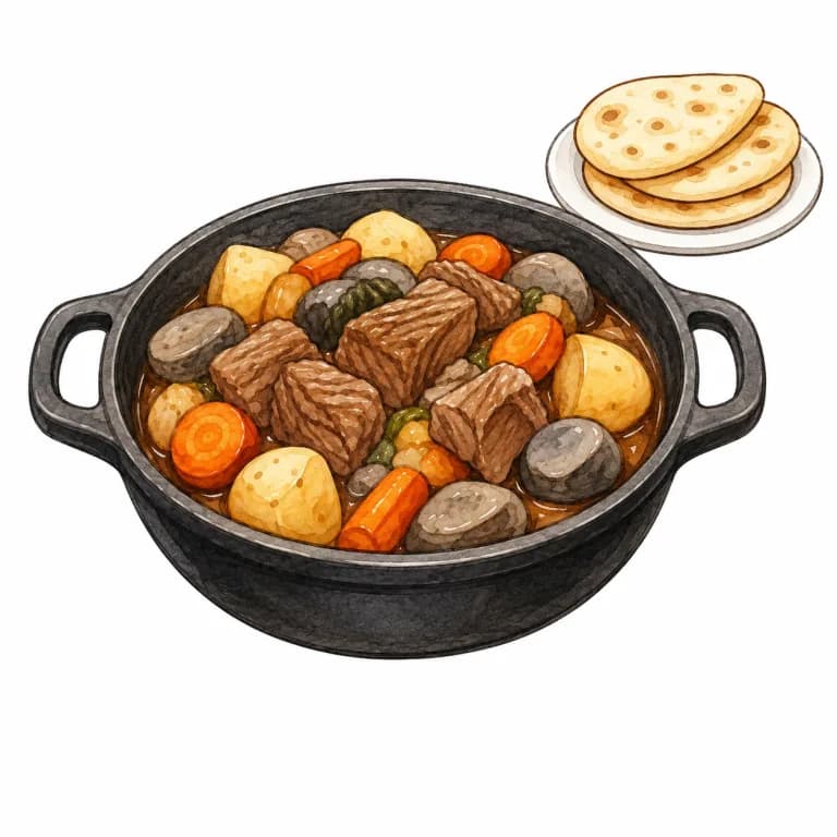
Source-style food image
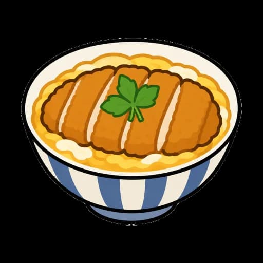
Transparent sticker output
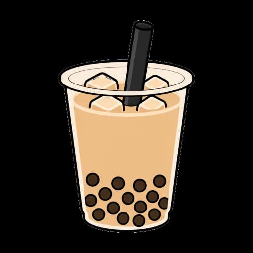
Transparent sticker output
Sample assets are used to demonstrate browser-side cleanup and export behavior. Your own images stay on your device.
Common menu asset mistakes
Over-cropping the plate
Food images often need the bowl, tray, or garnish to remain visible. Use a square fit instead of cutting tight around the dish.
Ignoring dark outlines
Sticker-style food can have black outlines that look heavier at small sizes. Preview at thumbnail size before publishing.
Mixing photo and illustration styles
A menu grid looks cleaner when assets share a similar visual style. Use ByteCut to normalize size, but still review style consistency manually.
For restaurant menus and delivery app food images
Food images often need more than a simple resize. ByteCut helps keep plates, bowls, handles, and food edges intact while producing consistent transparent menu assets.
Built for food asset cleanup
- Food-specific post-processing protects plates and bowls on white backgrounds.
- Large output is checked against illustrated dishes with handle holes and transparent regions.
- Outputs are sized for menus, category icons, kiosks, and ordering screens.
- Quick cleanup remains the safer default when AI produces rough textures on food images.
What makes a menu photo work as a small icon
The dish has to survive being shrunk
A menu thumbnail is often rendered around 200 pixels wide, and at that size a customer is not studying the garnish. They are deciding whether this is the fried chicken or the stew. Photographs shot wide, with the dish sitting small inside a styled table scene, lose that read entirely once scaled down. Crop in to the dish before you think about anything else, and judge the crop at the size the list actually uses rather than on a full-screen preview.
The plate is part of the subject
Removing the background around a plated dish is harder than it looks, because a white plate and a white studio backdrop are nearly the same colour. Cleanup can eat into the plate rim, break the outline along the bottom, or leave the underside faintly see-through. Check the lower edge of the plate and the two sides where the ellipse is widest — that is where a broken outline shows up first, and it is the part that looks obviously wrong once the icon sits on a coloured menu card.
Real openings versus bright surfaces
Pans and pots bring a specific problem: the gap inside a handle genuinely is background and should be transparent, while the pale surface of a broth or a ceramic bowl genuinely is the dish and must stay. These two look similar to an automated cleanup. If a handle opening stayed filled or a bright soup surface went patchy, that is the distinction failing, and it is worth a second look before the image goes into a live menu.
Consistency matters more than any single image
Menus are read as a column, not as individual pictures. One dish shot from directly overhead next to another shot at a low angle reads as sloppy even when both photographs are good. Pick one framing convention, one output size, and one background treatment, then apply it across the whole menu. A set of merely decent icons that match will look better than a mix of excellent ones that do not.
Photographs and illustrations do not mix well
Illustrated food icons cut out cleanly and stay legible at small sizes, which is why so many delivery apps use them. Photographs carry more appetite appeal but need more careful cropping. Both work; using both in the same menu does not, because the eye reads the inconsistency before it reads any of the dishes.
Food icon FAQ
Can ByteCut keep a white plate on a white background?
It uses food-specific mask refinement to reduce plate and bowl loss, though very low-contrast edges can still need review.
Which preset should I use for delivery menus?
Food 200px is a good default for menu thumbnails. Use Large for detailed assets or later editing.
Does AI always improve food images?
Not always. Food images can look rougher with AI, so ByteCut keeps quick cleanup as the safer default.
What should I check before using food icons in production?
Check pale plate edges, pot handles, small garnish, and open gaps between bowls before publishing the exported asset.
Can I use ByteCut for sticker-style food graphics?
Yes. Transparent sticker assets are a good fit because they need clean edges, consistent square framing, and lightweight WebP export.
Do the sample images represent uploaded user files?
No. They are demonstration assets for explaining the workflow. ByteCut processes your own images locally in the browser.
All processing runs locally in your browser. No files are uploaded.
Clean a Food ImageRelated Use Cases
Image Asset Cleanup
Turn source images into production-ready assets with cleanup, size normalization, and WebP export.
Remove Background
Create transparent cutouts that are ready for menus, app assets, listings, and UI libraries.
Convert to WebP
Reduce file size while maintaining visual quality. Ideal for faster websites and better SEO.
Resize Icons
Normalize image dimensions for app icons, menu thumbnails, and reusable design assets.
AI Generated Food Images
Prepare AI-made food images for menus, blogs, recipe cards, and lightweight WebP publishing.
Sticker Assets
Transparent sticker images for messaging apps.
Character Assets
Transparent character art for stickers, avatars, game prototypes, and app UI.